Overview
MAPS (Mentoring for Advanced and Professional Success) is a non-profit organization that assists California’s former foster youth who are applying to graduate programs.
After connecting with Sylvia Sensiper, PhD, one of the coordinators of MAPS, I’ve learned that they’re looking to build a new website for donors, while maintaining a separate website just for students. They had a marketing opportunity upcoming with FosterStrong and wanted to have a simple one-page website.
Results
MAPS has a responsive and accessible website that clearly communicates the organization's mission and serves as an education portal for students and mentors. It allowed to attract new donors and made students excited about the program.
Role
UX Designer
UX design, IA, UI, accounting for accessibility
Tools
Figma, WordPress, Photoshop
Understanding the needs
MAPS (Mentoring for Academic and Professional Success) is a re-organization of a successful pilot project developed at UC Davis that helped over eighty former foster youth become doctors, dentists, professors, business analysts, teachers, social workers, lawyers, counselors, and college advisors. They have a marketing opportunity upcoming with FosterStrong (urfosterstrong.org) and would like to be able to point people to the website. MAPS has a very basic website built as a WordPress blog. It's a stodgy, information-heavy education site, but most importantly it has very little info about the organization itself and doesn't offer an option to donate money.
It was important to build the website with WordPress so that coordinators of the program would be able to update the website when they need to.
It was important to build the website with WordPress so that coordinators of the program would be able to update the website when they need to.
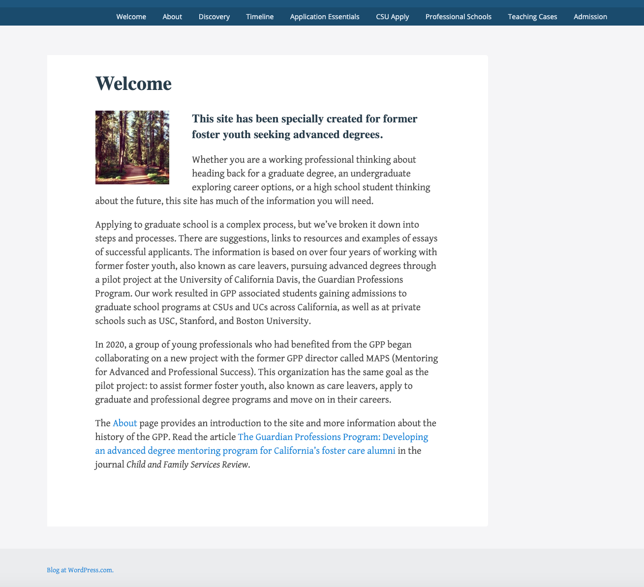
Screenshot of the old website
Information Architecture
The original task was to create a website that would allow potential donors to learn about the organization and to donate. I suggested combining the old blog with the new website instead of having two separate ones.
Pros of having one website:
The website will appear authentic and legit for potential sponsors. It will be apparent how much work goes into the mentorship and highlight the amount of information gathered to support prospective students.
It is a great opportunity to improve the experience for students as well. The old website doesn’t have the most efficient navigation and is somewhat confusing.
People share things on the web. Having one website means both students and potential donors can share the website and spread the word. It essentially becomes a single source of truth.
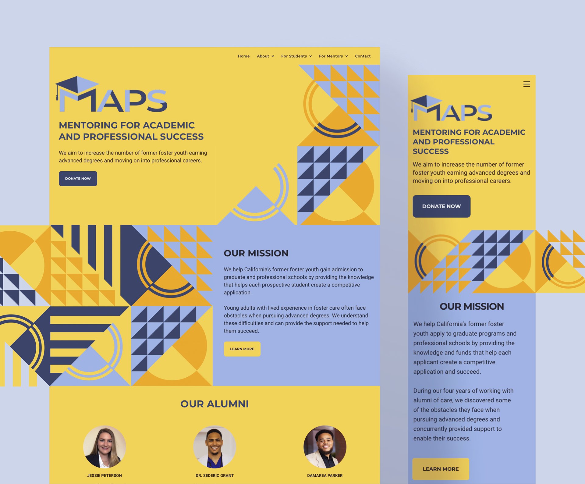
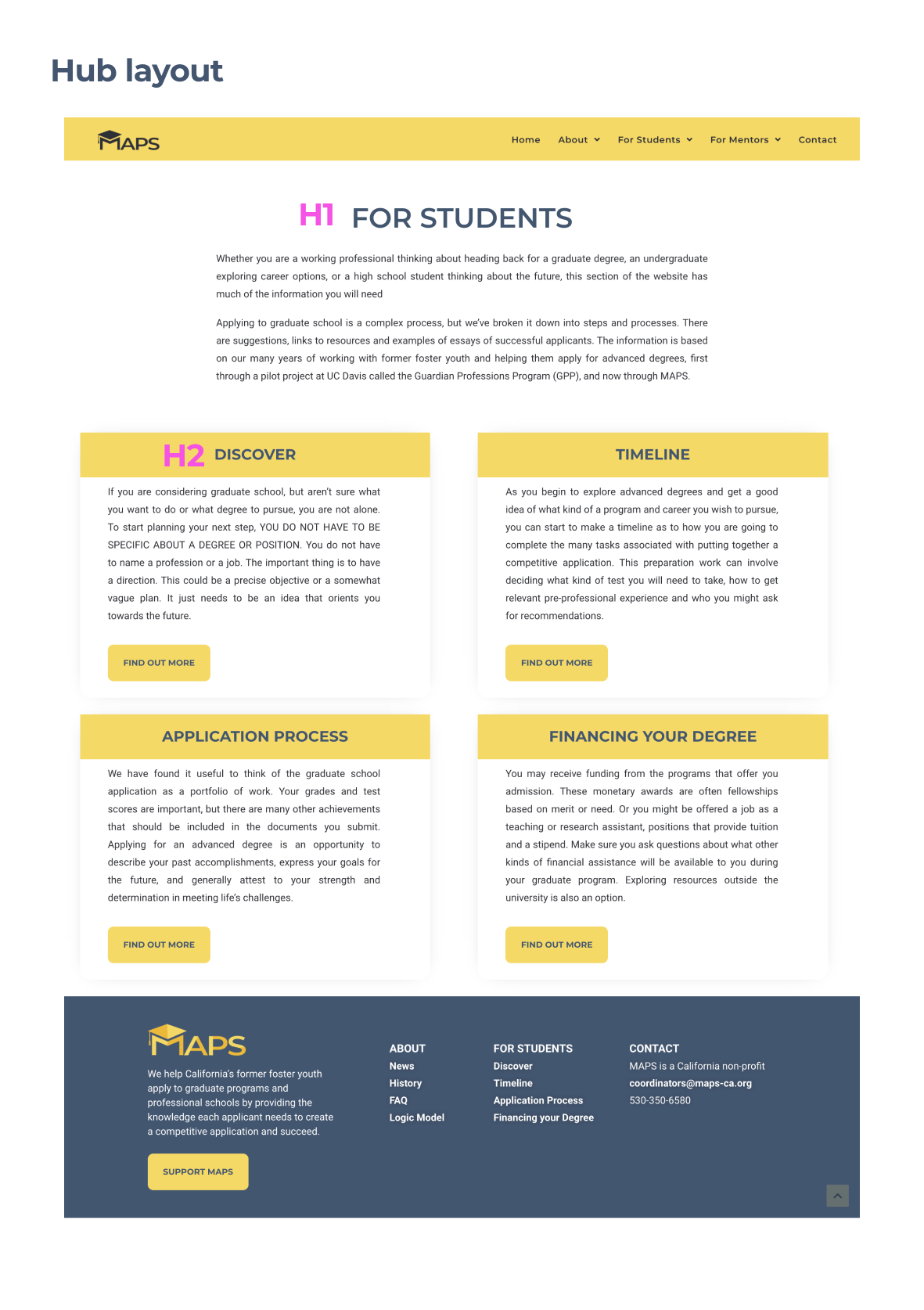
We worked together to create a new structure for the website and Sylvia did amazing job re-writing and consolidating articles. The new home page has a function of conveying the information about MAPS and its mission. There’s a hub for students and mentors with more information about specific topics they can find on the website.
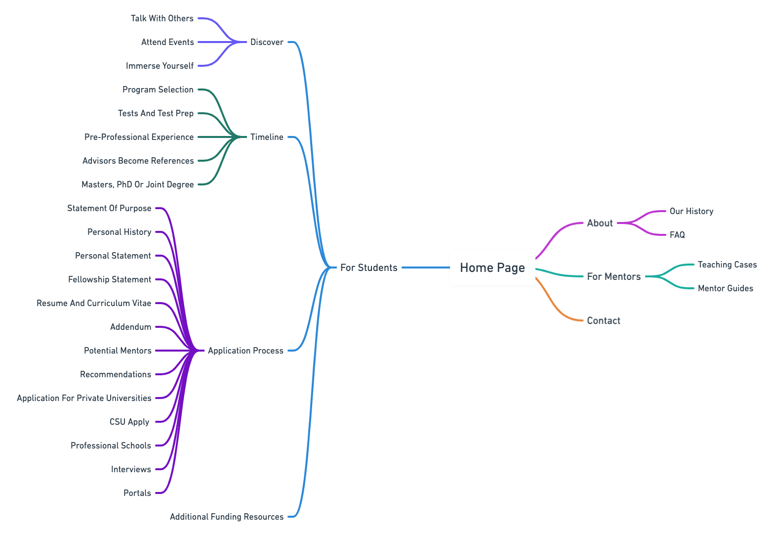
Site Map
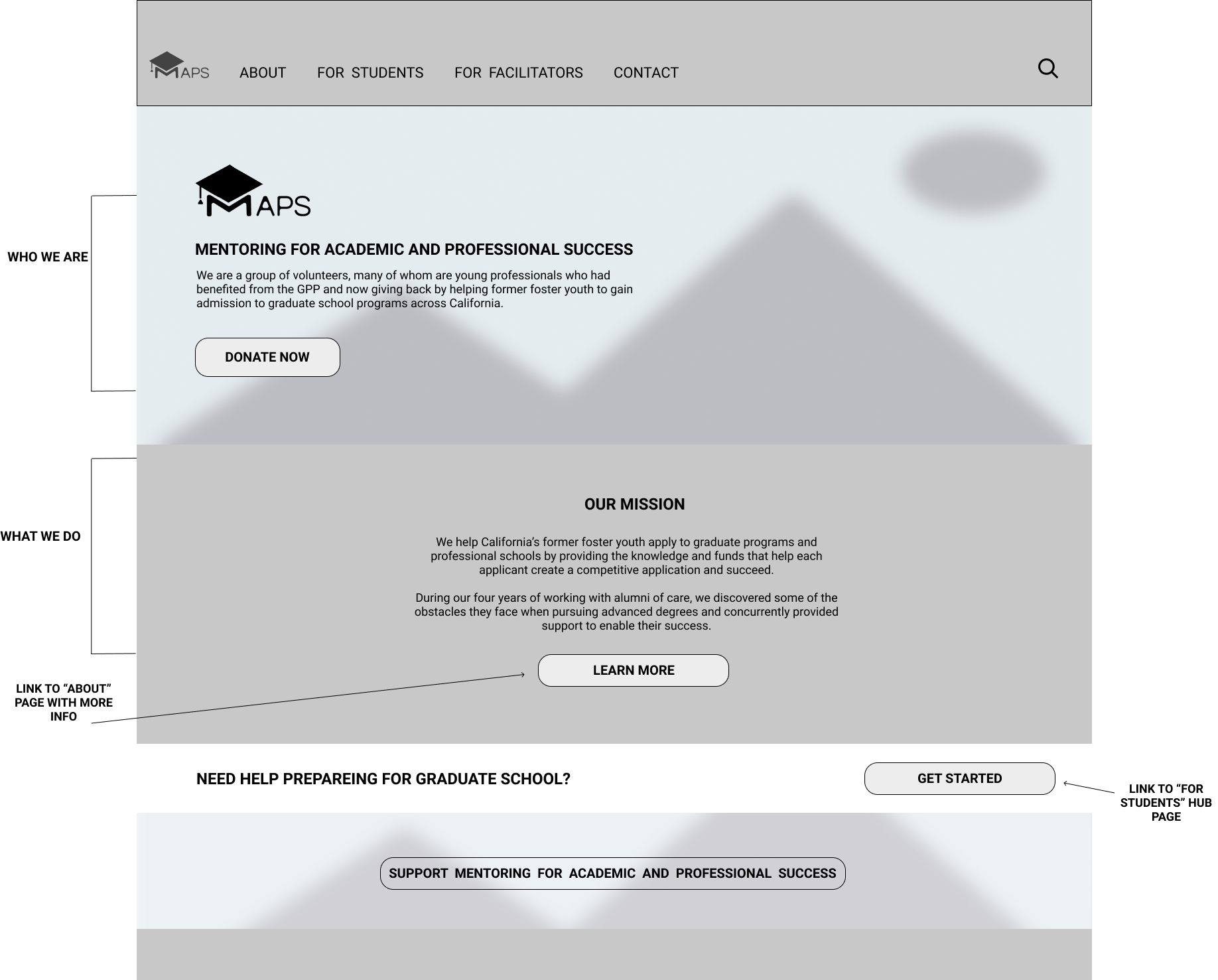
First wireframe of the home page
Prototypes
Prototype 1
Prototype 2
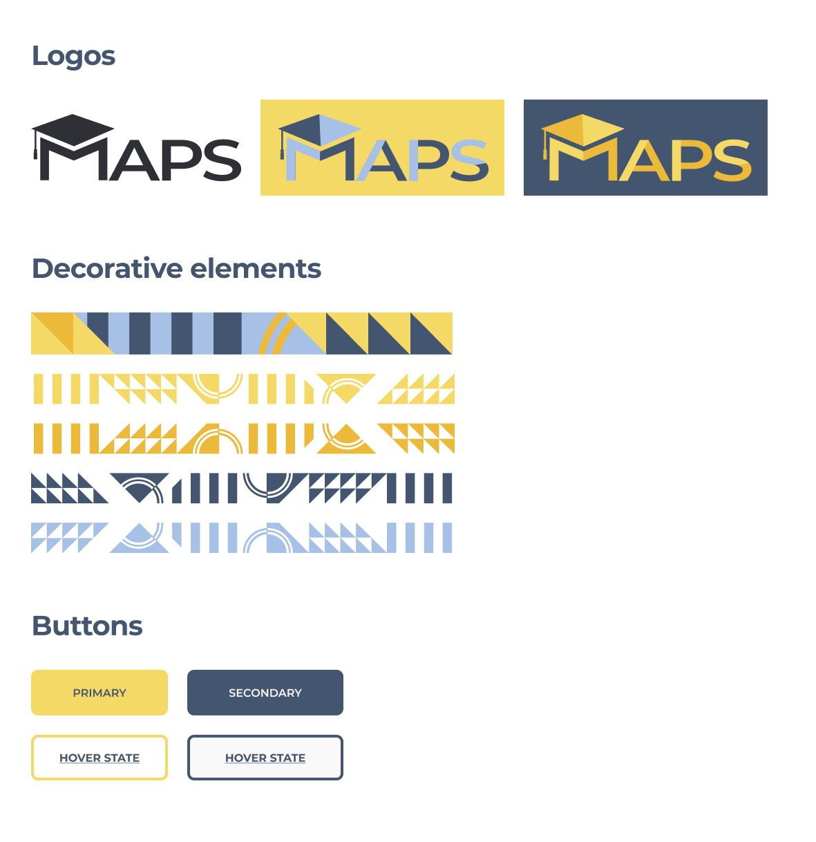
Logo Design
MAPS is an organization with the main focus on education and that’s where I drew my inspiration from.
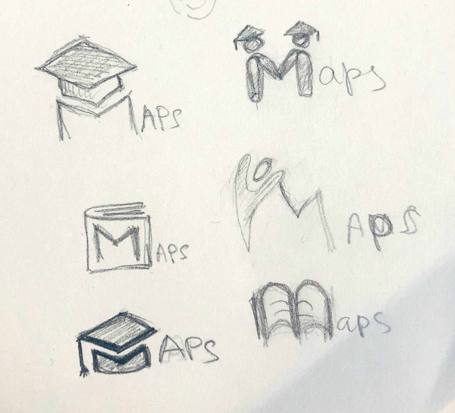
Sketching ideas
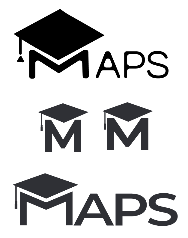
Refining the design
Art Direction
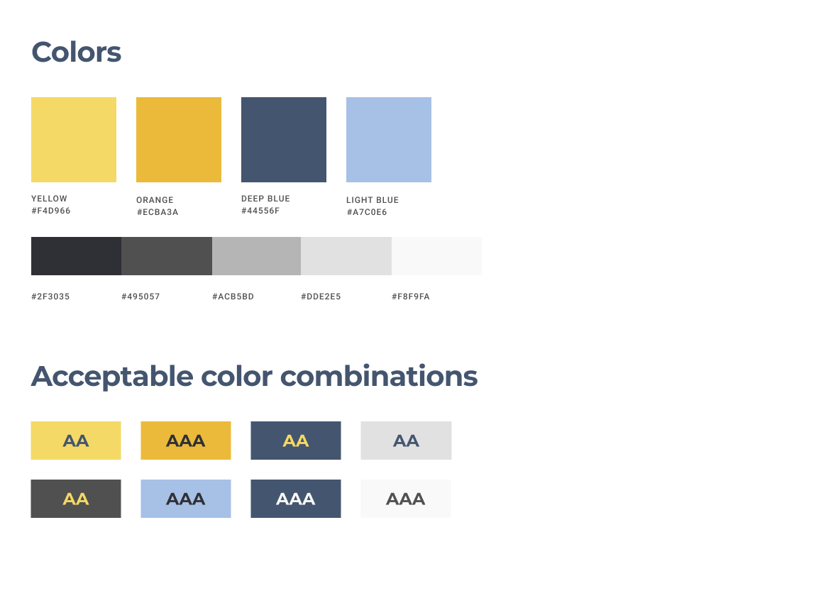
Sylvia wanted the website to feel connected to California, since that’s where the organization is based. We were exploring different ideas inspired by nature: sun, ocean, fish in the sea, forest, beach. We chose the yellow to represent the sun and the blue for the ocean. I wanted to include geometrical shapes as a nod to academia.
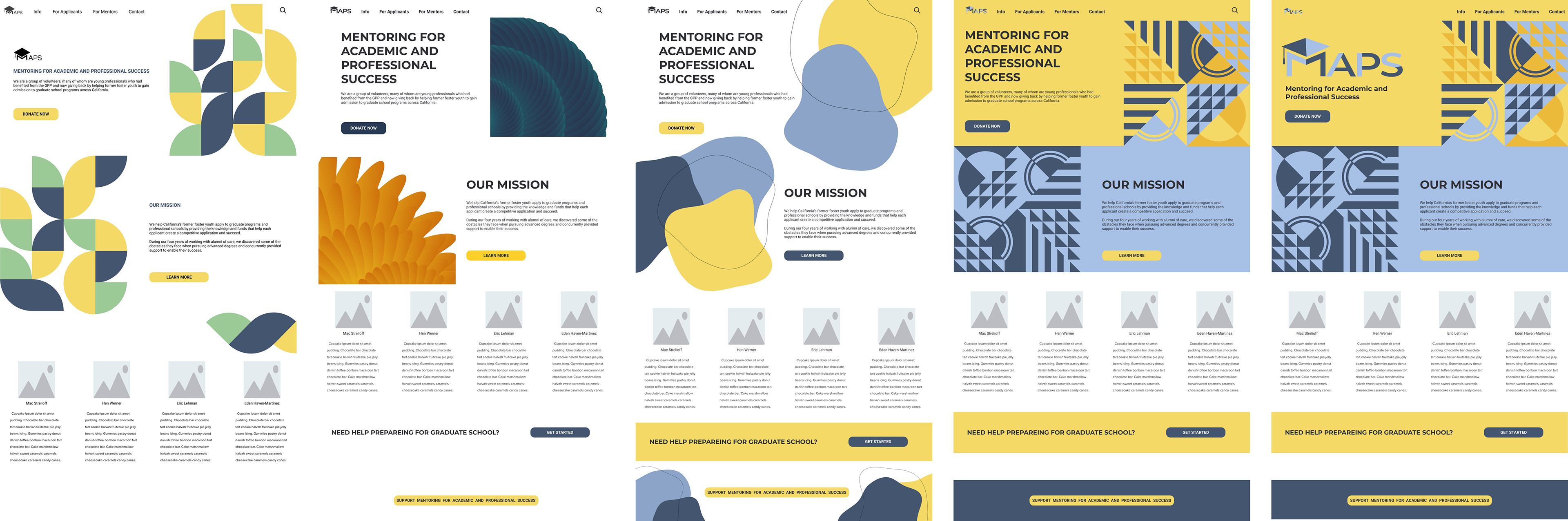
Visual design iterations
Challenges
It was essential to build the website using WordPress and use the tools that would allow the client easily make changes on their own. Having no budget, I had to do a lot of research to find the best free solution. I ended up using free version of Elementor builder with Ocean WP theme. My experience with WP was pretty limited and it took a lot of trial and error for all of it to work. I love a good challenge, so I really enjoyed figuring it all out.
Some of the things I originally designed I wasn’t able to implement. But instead of getting upset, I focused on usability of the website and making sure it’s responsive and easy to use.
User Research
I wanted to validate with users, both potential donors and students, usability of the website. Some of the questions I had:
• Is it easy to understand what is the main mission of the organization?
• Can donors successfully complete donation task?
• Are students able to find information they’re looking for?
• What participants think about overall look and feel of the website?
To do this I chose to conduct moderated usability study. With Sylvia’s help I was able to recruit 5 participants with different backgrounds.
Findings
Participants positively regarded the look of the website. They were saying that it looks “ … scholarly, in the sense that it’s got circles and squares and triangles and so it’s invoke invoking learning or the possibilities of doing something interesting” and that it feels “…nice and inviting”, “…bright and optimistic”.
There was confusion with how the mission statement was formulated. Users were not sure what some of the words meant.
Participants pointed out some of the questions that they were expected to get answered under the FAQ section and were not able to find answers to. The “History” page felt “wordy” to some and without clear order of events.
Donation task confused the most, since participants were redirected to a page from a different organization. It wasn’t clear why the page had a different name and looked very different from the website.
Solutions
Since MAPS is a fiscally sponsored project and receives their donations through Marcus Foster Education Institute we don’t have control over how the donation page looks like. We added information on a “Donate” page explaining this and informing users of what is about to happen to eliminate the confusion.
Information on the homepage was rewritten using simpler words. FAQs were updated with new questions and the “History” was rewritten as well.
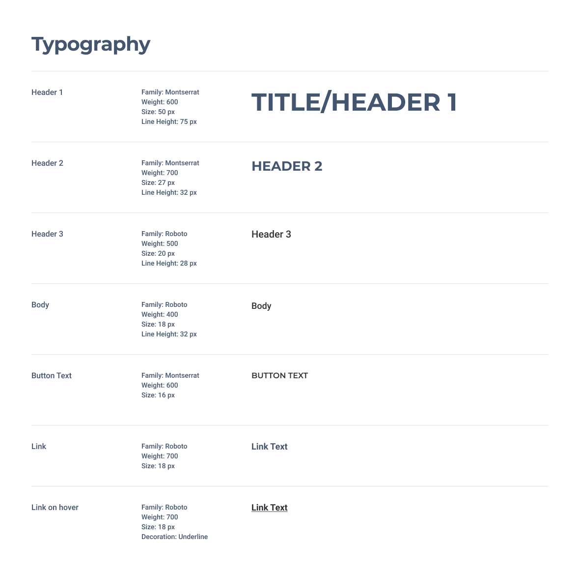
Design System
Every product should have a well defined design system to ensure consistency across all of the pages and experiences. For a project like this it’s also a tool for the organization to maintain the website and to easily add new pages when needed.
Results
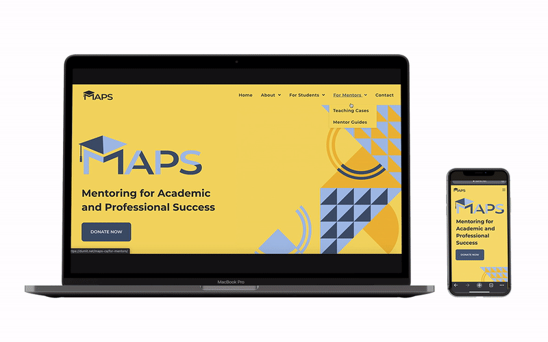
MAPS has a new website that clearly communicates the mission of the organization, it’s easy to use and students can find information they’re looking for. It opens up great opportunities for raising funds to support organization’s activities.
The website is responsive and built according with the accessibility standards.
The client has a design system and tools to independently change the website.
Would we get there if I just followed the original task and did what I was asked to do? Most certainly not. Design requires curiosity and persistence and it’s totally worth it.