Overview
Mattapan Food and Fitness Coalition (MFFC) is a non-profit organization based in Boston, MA. They are focused on health, food, advocacy, youth development, and empowerment of the Mattapan community. Having a well-structured and nice-looking website is instrumental for their work, especially during the pandemic. The old website lacked consistency, wasn't responsive, and required a major redesign.
Results
The redesigned website allowed MFFC to reach more people in their community and attract new sponsors. Having a responsive website was integral for reaching a younger generation. The design system will allow the organization to upkeep the website.
Role
UX Designer
UX design, IA, UI, accounting for accessibility
Tools
Figma, Wix, Photoshop
Good looking and well functioning website is integral to any organization, but more so during the global pandemic and even more so if you’re a non-profit organization trying to support people of colour during the duo health crises of COVID-19 and racism.
Mattapan Food and Fitness Coalition (MFFC) is a non-profit organization based in Boston, MA. They are focused on health, food, advocacy, youth development, and empowerment of Mattapan community. They are young, fun and energetic.
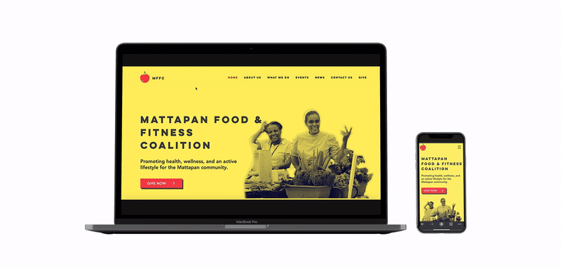
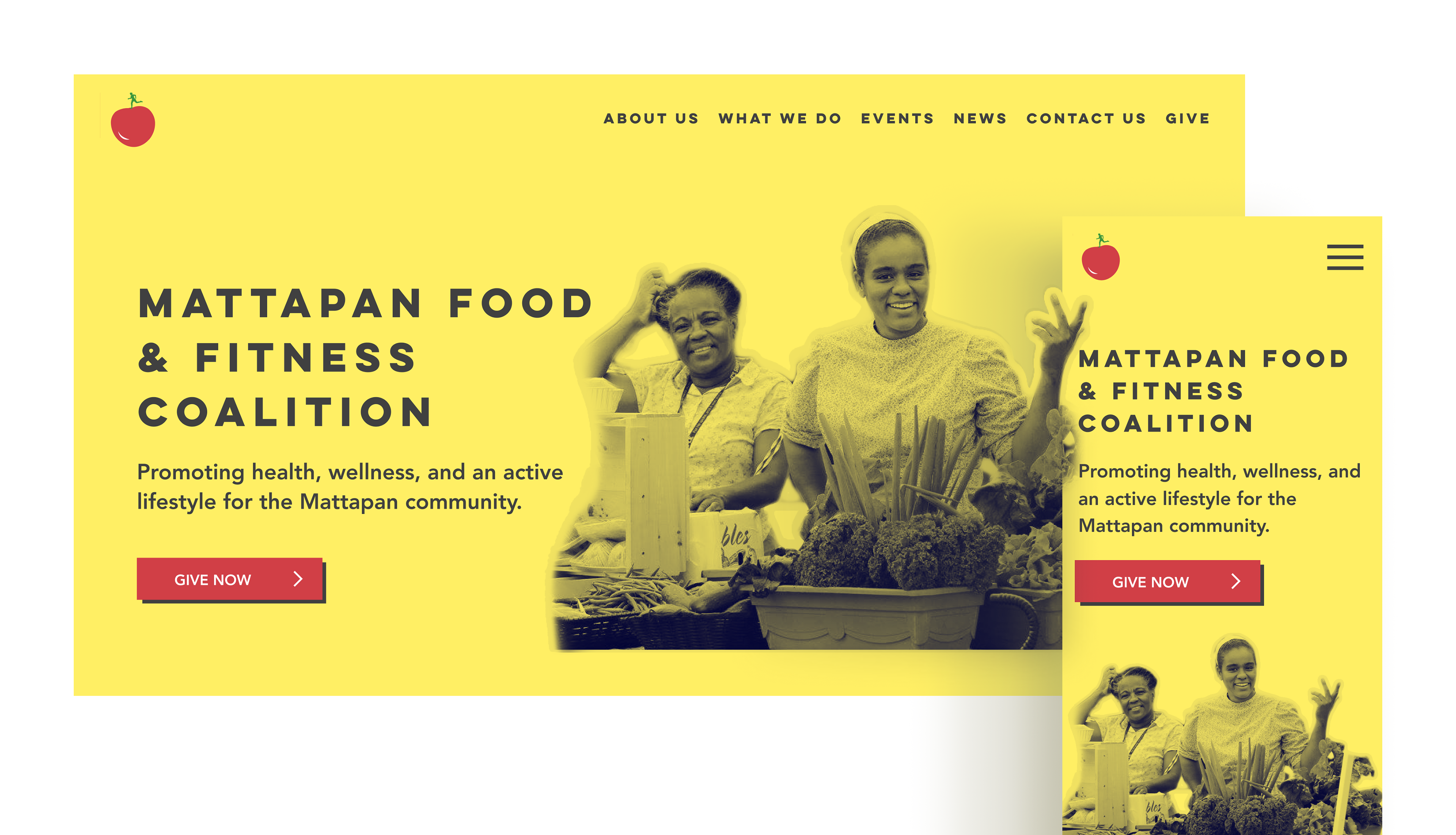
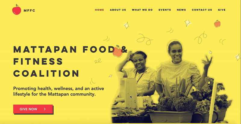
This is the redesigned website.
And this is the website before the redesign.
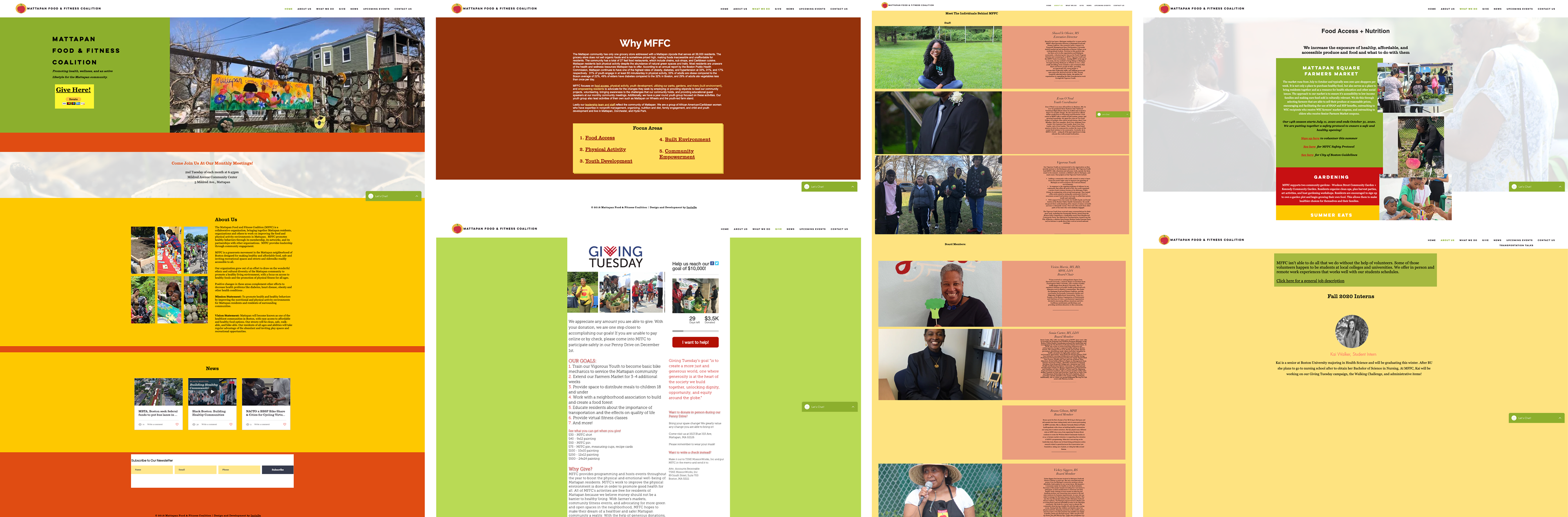
Screenshots of an old website
Out with the old. Audit
I started my work with Shavel’le Olivier who is an Executive Director of MFFC, by defining the site’s purpose and organization’s goals. She shared that people in the community need to know how the organization can help them. Monthly meetings and newsletters are a way to keep members informed and engaged. And as with many non-profit organizations, MFFC relies on individual donations to support their activity.
We talked about the overall design of the website along with accessibility. Some colors that are being used might not provide enough contrast between the copy and the background. It was also important for me to learn how the new pages and information are being added to the website.
We talked about the overall design of the website along with accessibility. Some colors that are being used might not provide enough contrast between the copy and the background. It was also important for me to learn how the new pages and information are being added to the website.
Some of the takeaways were:
• lack of consistency across the website
• poor color contrast for accessibility
• too many different fonts and styles
• not responsive, when new pages are being added they’re not being tested on mobile
• poorly structured IA and navigation
• a long path to the essential information
• walls of text that are hard to scan
• no CTA buttons that would help both users and the organization to achieve their goals
Information Architecture
After the audit, many zoom calls, and emails, I redesigned the information architecture. New subcategory pages were added and content from multiple pages was combined into one.
Key services and activities were surfaced on a home page for better discoverability.
Key services and activities were surfaced on a home page for better discoverability.
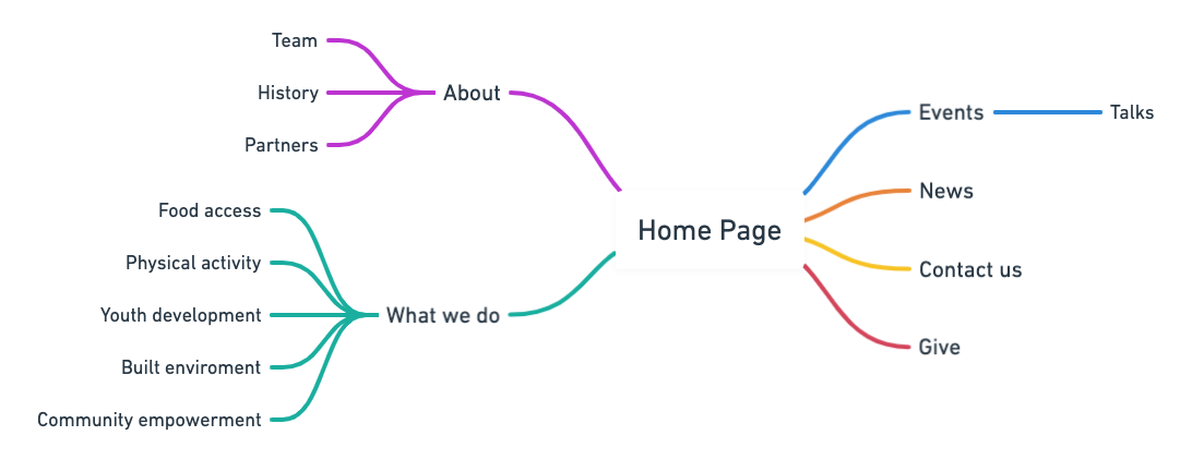
Site Map
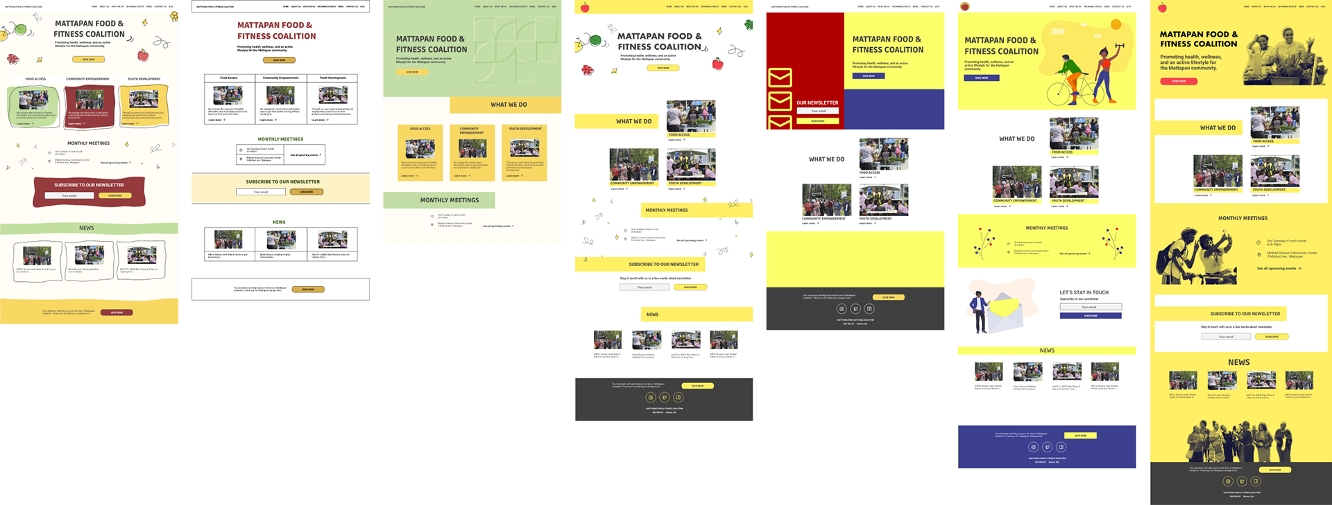
Wireframes and Prototyping
I wanted to create a system of different page layouts depending on their hierarchy in the IA and their purpose. Main category pages serving as a getaway to the subcategory pages while also providing you with some context for the category. This all will go into the Design System and ensure consistency when the new pages will be added in the future.
Wireframes and the prototype
UI Exploration
Mattapan community is very vibrant, young, and energetic and it was important to reflect that. Their main activities are focused on food access and they have a biking program for youth. This inspired me to create some hand-drawn elements including apples (inspired by the logo) and bikes.
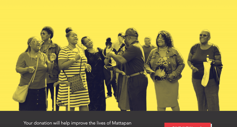
They have so many wonderful candid images from the community events and I wanted to somehow incorporate them into the design as well. Having a background in photography helped me to come up with the idea for the creative treatment of the photographs.
They have so many wonderful candid images from the community events and I wanted to somehow incorporate them into the design as well. Having a background in photography helped me to come up with the idea for the creative treatment of the photographs.
Design iterations
Challenges
The website was built on Wix and Shavel’le is familiar with it enough to be able to add new pages. So I had to learn how to use it. The learning curve wasn’t too steep, but I found the builder experience to be very frustrating. A lot of the pages were outdated and the old Wix editor doesn’t offer much when it comes to responsive design. I suggested taking advantage of the new editorX and this is something that MFFC is considering as of right now. On the bright side, this whole situation inspired me to finally sign up for a coding class :)
There’s definitely some design debt and I’m thinking about this as our MVP. If the cost of switching to a new plan will be approved, we will build the next iteration of the website using the new editor.
There’s definitely some design debt and I’m thinking about this as our MVP. If the cost of switching to a new plan will be approved, we will build the next iteration of the website using the new editor.
Design System
I strongly believe that my job as a designer goes way beyond pixels. One of my “non-designer” responsibilities is to educate and share my knowledge. Because every person who touches the product or makes decisions is a designer. This is a perfect opportunity to quote Jared M. Spool who said “Everyone’s a designer, but not everyone is a good designer. However, everyone can become a better designer.”It was important for me to ensure Shavele’le knows about color contrast, consistency in elements, and layouts. As a positive side effect, I felt that it also improved our communication because now we’re aligned and share the same vocabulary.
I can spend hours talking about design systems and why everybody needs them, and as Dan Mall said it here : …the value (of the design systems) is not only in creating libraries and systems but also building custom tools to help the people charged with maintaining and extending those systems. In the context of this project, it’s especially important.Shavel’le and her colleagues should have tools to be able to maintain the consistency of the website as it changes and new content is being added. The design System that I made for them is simple and includes typography, colors, and building blocks for different types of pages.
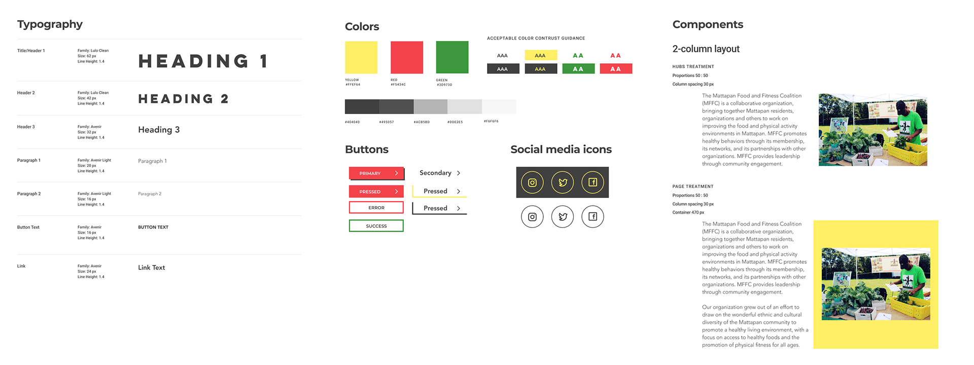

Design System
A little extra something
Added on-hover animation, because you should always surprise and delight your users.
On-hover animation
Footer animation
This is not the end
Design is never finished. It’s always evolving and changing. I’m looking forward to meeting Mattapan community members and doing some usability testing with them.
Hopefully, we will be able to switch to a new platform and re-build the website on it. I’m excited about what’s next!
Hopefully, we will be able to switch to a new platform and re-build the website on it. I’m excited about what’s next!