

Overview
Brooklyn Bread is a sandwich shop in Brooklyn, NY. Brooklyn Bread strives to provide healthy meal options to their community and pride itself in being very accommodating of any dietary restrictions. It needs an app that will allow customers to customize their sandwiches.
This project was developed during the Google Design Program.
Results
Designed an app for Brooklyn Bread that allows users to build their perfect sandwich and easily order it.
Role
UX Designer
Research, wireframing, creative direction, prototyping, usability studies, accounting for accessibility, and iterating on design
Tools
Figma
The problem:
Busy Brooklynites don’t have time to cook lunch and need to be able to order food that is both delicious and fits their diet.
The goal:
Design an app for Brooklyn Bread that allows users to build their perfect sandwich and easily order it.
User research
I conducted interviews and created empathy maps to understand the users I’m
designing for and their needs. A primary user group identified through research
was working Brooklyn residents who don’t have time to cook meals.
designing for and their needs. A primary user group identified through research
was working Brooklyn residents who don’t have time to cook meals.
Research revealed that time was not the only factor limiting users from cooking at home.
Other user problems included global pandemic that made it
difficult to go to restaurants in-person.
Other user problems included global pandemic that made it
difficult to go to restaurants in-person.
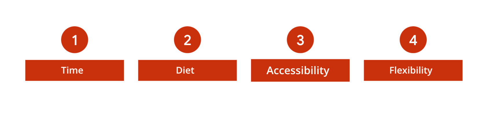
Pain points
• Working adults don’t have time to cook nutritious meals
• Most restaurants have limited options when it comes to dietary restrictions
• Most food ordering platforms are not equipped with assistive technologies
• Ability to schedule ahead of time and not be distracted during the meetings
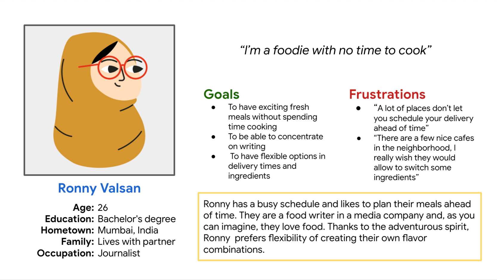
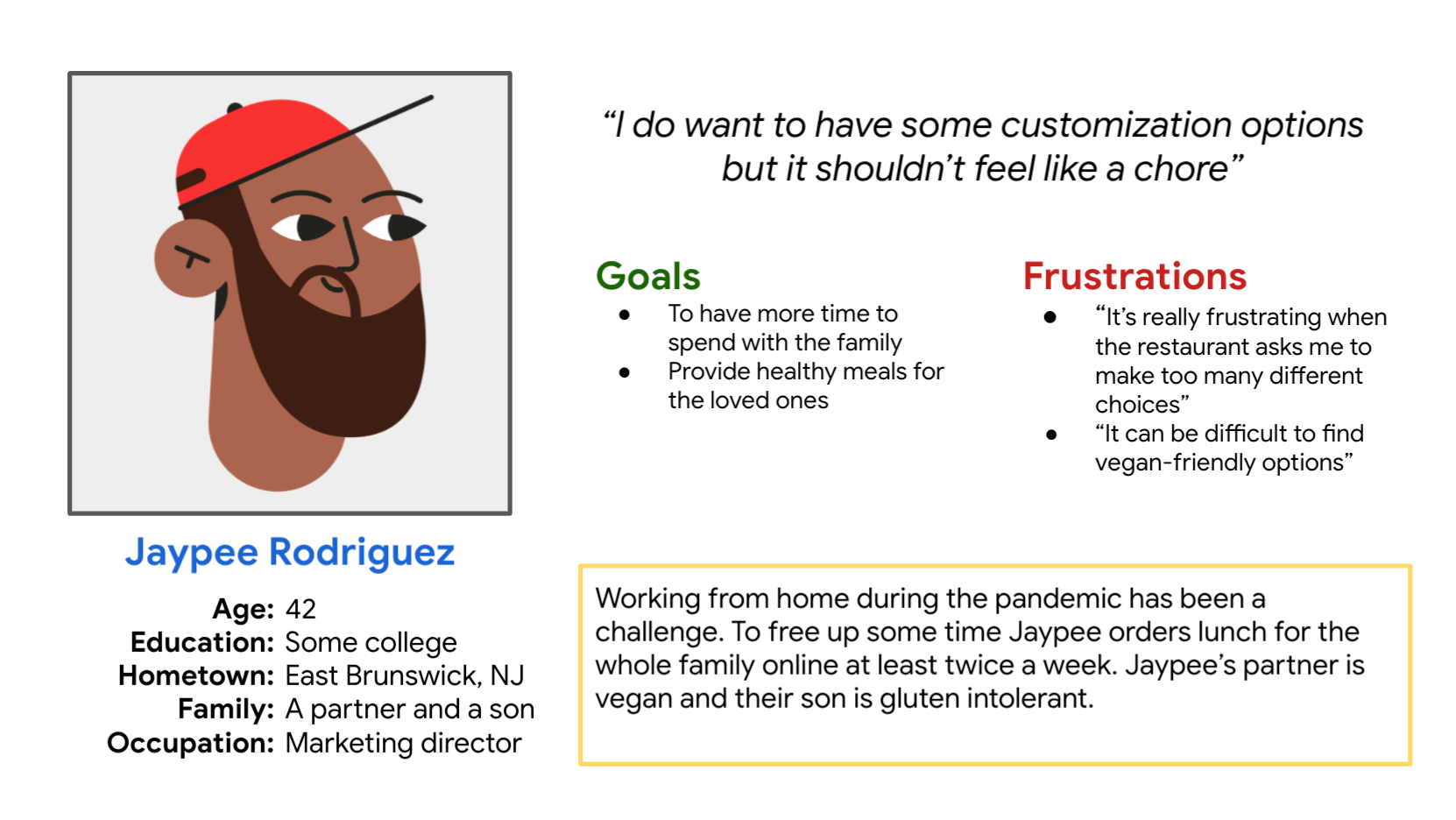
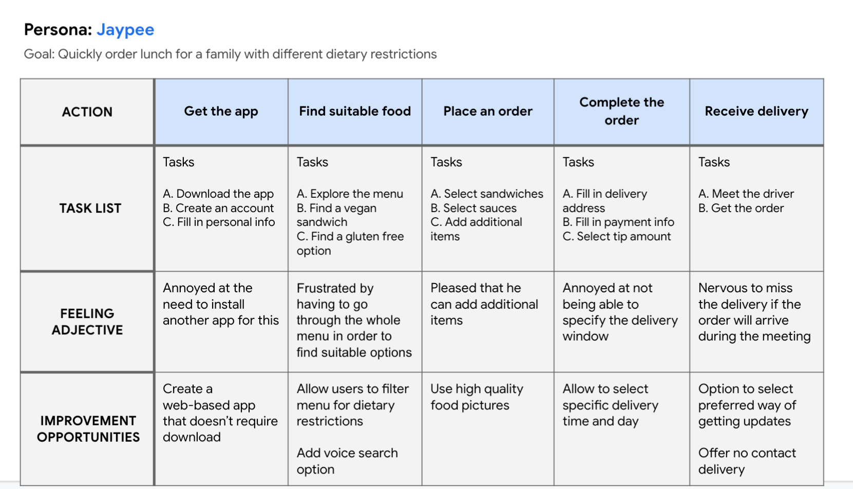
User personas
User journey map
For the user journey I focused on Jaypee Rodriguez.
Problem statement:
Jaypee is member of a household with dietary restrictions who needs a frustration free way of ordering lunch for their whole family on a busy day so they can focus on a quality time with their loved ones.
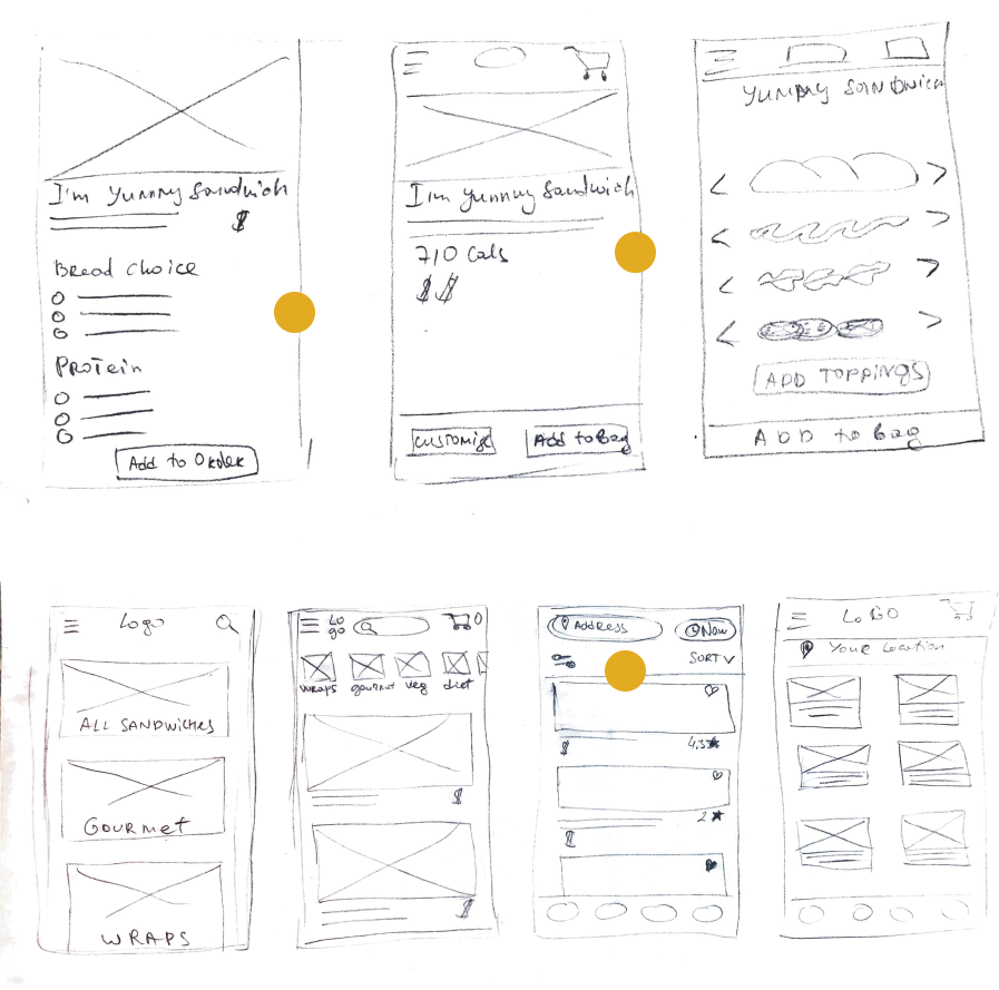
Paper wireframes
Taking the time to draft iterations of each screen of the app on paper ensured that the elements that made it to digital wireframes would be well-suited to address user pain points. For the product screen, I prioritized a quick and easy customization options to help users save time.
Dots were used to mark the elements of each sketch that would be used in the initial digital wireframes.
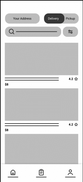
Digital wireframes and low-fidelity prototype
As the initial design phase continued, I made sure to base screen designs on feedback and findings from the user research.
Some of the features included:
• List of different options allows to build your perfect sandwich
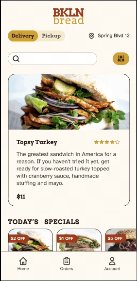
• The floating button that allows you to easily place an order regardless of where on the page you are
• Different ways to narrow down the list of the products
• Option to specify your dietary restriction needs to speed up the process of finding a sandwich you want
Using the completed set of digital wireframes, I created a low-fidelity prototype. The primary user flow I connected was filtering products and ordering a sandwich, so the prototype could be used in a usability study.
Usability study
Study type: Moderated usability study
Participants: 5 participants between the ages of 18-62 who reside in metropolitan and suburb areas. Participants order out at least once a week.
I conducted two rounds of usability studies. Findings from the first study helped guide the designs from wireframes to mockups. The second study used a high-fidelity prototype and revealed what aspects of the mockups needed refining.
Round 1 findings:
• Users were confused by the amount of screens they need to go though to fill out payment info
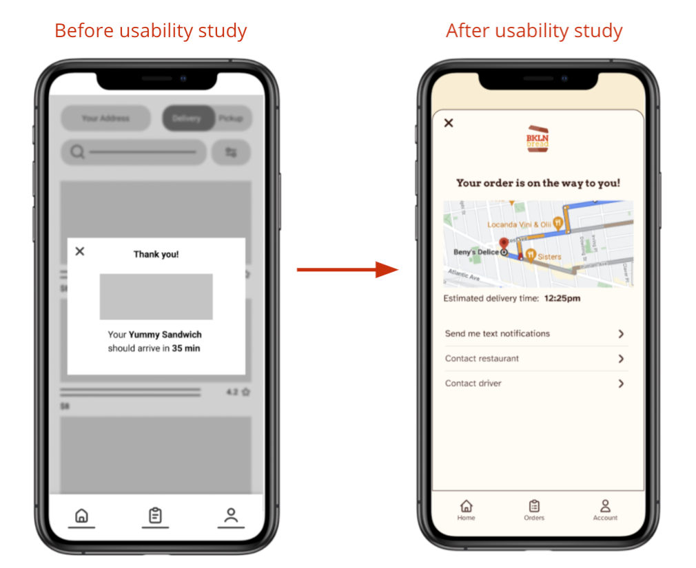
• All the participants were surprised that there’s no order tracking available
• Some users questioned usefulness of the “See your cart” screen
Round 2 findings:
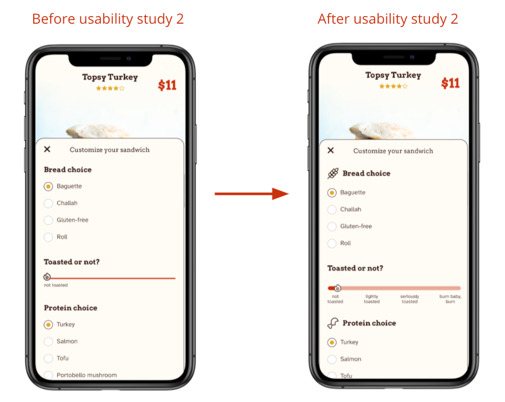
• Unclear what are the levels for toasting the bread
• Users were looking for visual cues to navigate different options in a long list of sandwich components
Mockups
Early designs allowed for some customization, but after the usability studies, I added additional screen to track the order. I also revised the design so users can have easy access to contact information without the need to go to the separate tab.
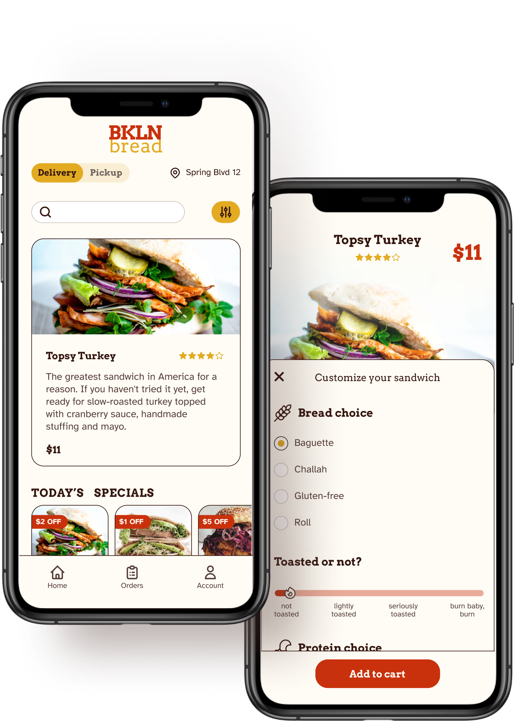
The second usability study revealed confusion with the toasted slider. To provide clear communication, I added the progress bar and copy associated with each of the points along the bar.
I also added icons to different sections to provide visual cues and make the list more scannable.
Accessibility considerations
• Used accessible color combinations with the contrast ratio of at least 4.5:1
• Used Atkinson Hyperlegible font for improved readability
• Used icons to help make navigation easier
• Provided access to users who are vision impaired through adding alt text to images for screen readers
Design System
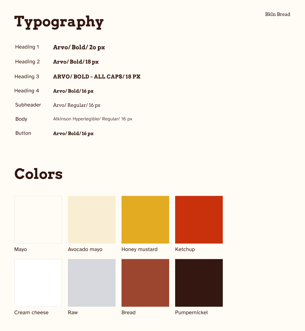
Typography and colors
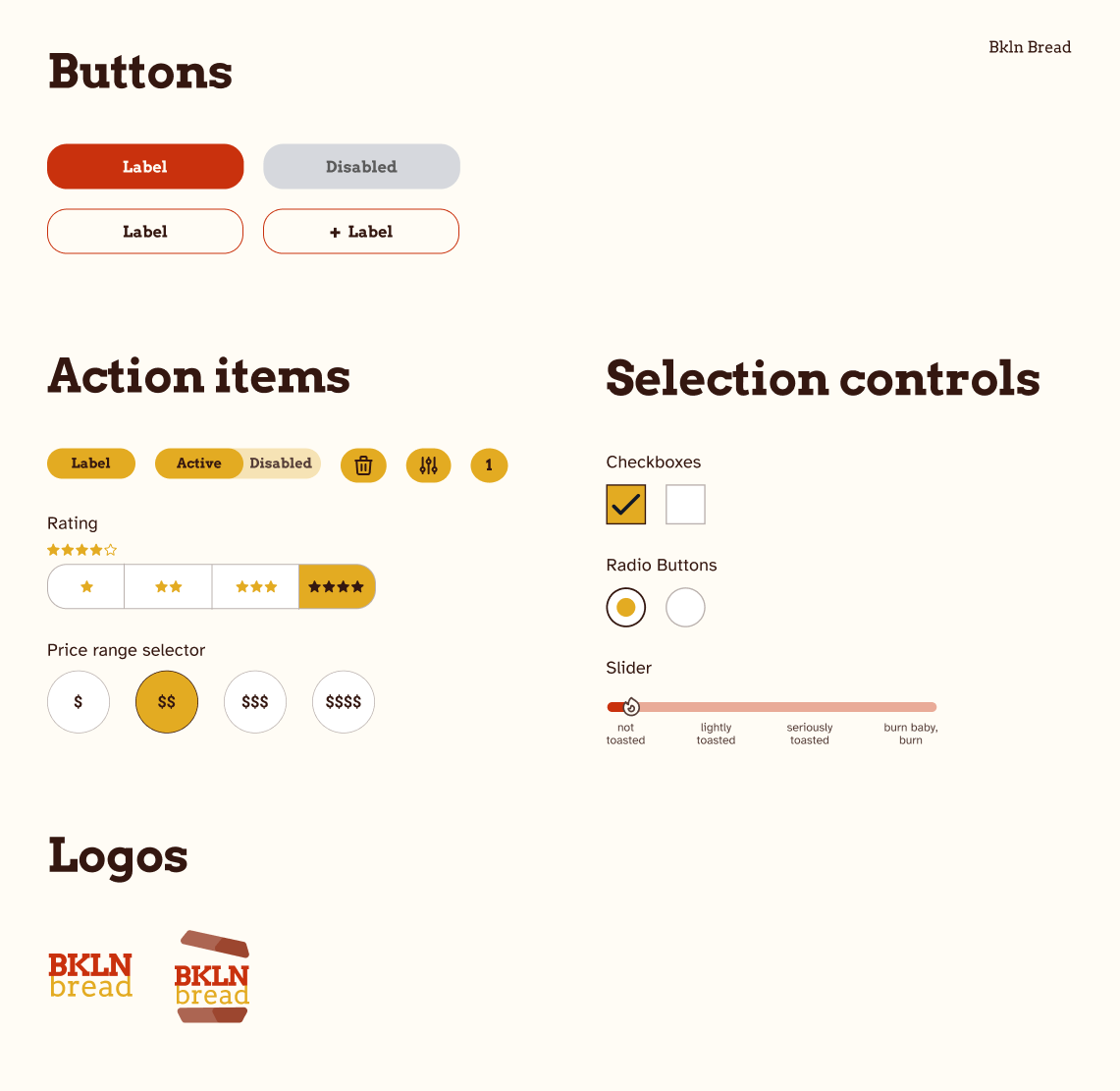
Buttons, action items and logos
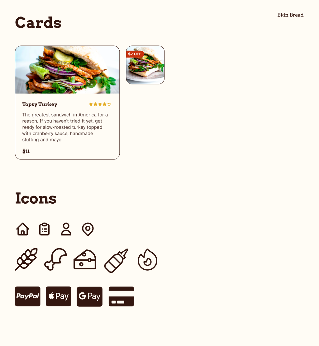
Cards and icons
Key mockups

Home screen
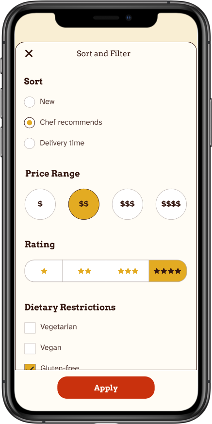
Sort and filter
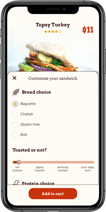
Product page
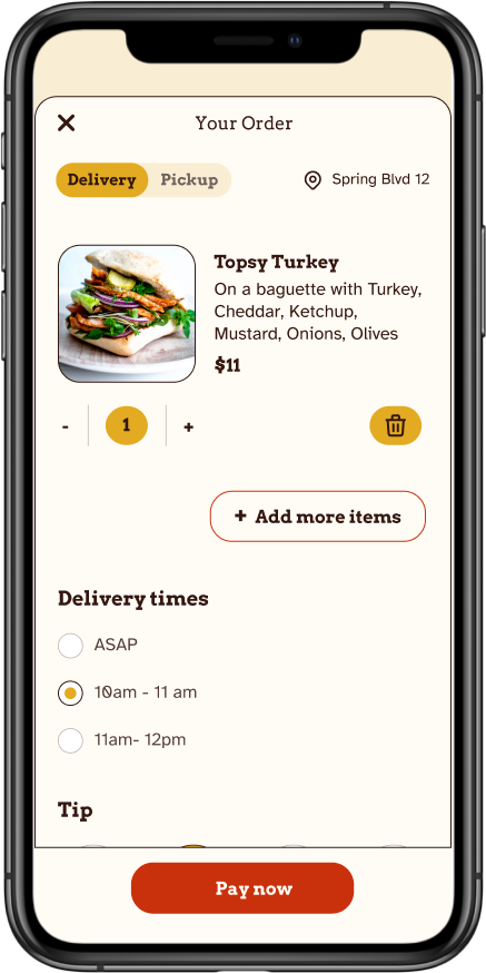
Checkout
High-fidelity prototype
The final high-fidelity prototype presented cleaner user flows for customizing a sandwich. It also met user needs for a pickup or delivery option as well as more customization.
View the the Brooklyn Bread high-fidelity prototype
Takeaways
Impact.
The app makes users feel like Bkln Bread really thinks about how to meet their needs.
One quote from peer feedback:
“The app made it so easy and fun to build my own sandwich! I would definitely use this app as a go-to for a delicious, fast, and even healthy meal.”
What I learned.
While designing the Brooklyn Bread app, I learned that the first ideas for the app are only the beginning of the process. Usability studies and peer feedback influenced each iteration of the app’s designs.